How To Keep Your Healthcare Signage Compliant With CQC Standards
On Wednesday 9th July, Signs Express hosted a free webinar for healthcare professionals about CQC Standards. You can watch the full recording on Youtube by clicking the button below, or read the transcript in our blog post below.

Webinar Transcript
Before we begin, we're not here to interpret regulations—that's what you do. We're here to help you produce functional signage. But it's not just signage. There are many additional products we can offer to enhance the patient and visitor experience. It doesn't have to be a health and safety sign or a warning sign. Yes, we produce those, but we can make them visually attractive and more appealing. It doesn't have to be basic.
What we'll cover includes signage in healthcare, CQC's five key questions, how to audit your premises and space, additional considerations, examples, and some of the next steps. The key takeaways will hopefully include consistency in signage and language, along with inspiration for effective and aesthetically pleasing signage.
Signage in Healthcare
One point of confusion in hospitals and trusts is that CQC guidance is often interpreted differently. CQC itself is not legislation but is regulated by the Health and Social Care Act 2008. In the industry, you'll find slightly different solutions depending on interpretation. A hospital in Norfolk may apply the structure differently from one in Lichfield, for example.
It’s about making the experience easier for your patients and clients. From the moment they arrive, they should know: Am I in the right place? Am I going to the right area? Am I seeing the right person? Think of the process as though you're walking it for the first time. You're guiding someone regardless of their orientation, language skills, or education level.
Must-Haves
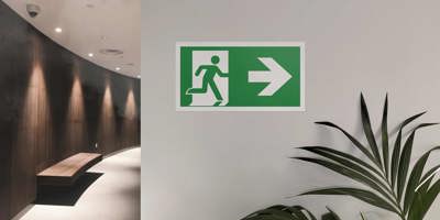
The must-haves may seem obvious: health and safety signage such as fire exits and hazard points. These should be regularly reviewed and maintained by someone within your business.
CQC ratings should be displayed within 21 days of receiving them. These ratings help inform patients and are a benchmark of quality. They should be presented clearly—whether through plaques or banners—and not hidden away.
Should-Haves
Staff know where everything is, but visitors don’t. New starters should be able to navigate from the car park to the correct part of the building. Wayfinding systems are critical. This is where a signage professional from Signs Express can help walk you through how to guide people clearly—using color-coded systems or departmental identifiers.
You also need to think about how changes will be managed. When a department moves, how easy is it to update the signage?
Could-Haves
Consider environments like children's areas in hospitals. These can be intimidating. Use design to make the space more welcoming. We've all seen peeling posters on walls. These details matter—they reflect the quality of your service. As you use the building regularly, you might not see the things that aren't working. But your patients do.
CQC’s Five Key Questions
We’ve reviewed CQC regulations and identified five key questions where signage can support better outcomes:
-
Regulation 9 – Person-Centred Care: Avoid adding stress. Use clear, concise, and easy-to-follow signage.
-
Regulation 10 – Dignity and Respect: Reduce embarrassment with privacy screens, films, and signs. Identify private areas and explain what’s happening inside.
-
Regulation 12 – Safe Care and Treatment: Accurate and appropriate safety signage is essential. Avoid dead ends.
-
Regulation 15 – Premises and Equipment: Ensure accessible and consistent wayfinding using color, pictograms, and simple language.
-
Regulation 17 – Governance: Keep legal signage up to date. Replace out-of-date names and information.
Auditing Your Premises
Start by auditing your space. Walking the site helps reveal things that are easily missed in daily operations. For example, one airport removed over 1,000 signs to reduce confusion, and it improved the visitor experience.
Begin with a floor plan—if you don’t have an architectural one, draw your own. Identify your primary destinations (like reception and pharmacy) and your secondary ones (like toilets and consultation rooms). Let’s make it easy for people to get into the building first and find the primary destination. Once there, it’s easier to guide them to secondary areas.
Is there clear access to features like outdoor play areas? Can signage be updated when consultants or rooms change? Use projecting signs, interchangeable door signs, and ensure wayfinding works both directions.
Common language matters. Don’t rely on outdated appointment cards if room numbers or labels have changed. Be sure that building blocks and floor levels are clearly marked.
Consider Distress or Anxiety
Visitors leaving the building might be distressed after a difficult appointment. Ensure signage is as clear on the way out as it is on the way in.
Start With an Audit
Walk the space with fresh eyes. Don’t assume what you’ll see. Signage professionals can approach this with an unbiased view. They don’t know where “phlebotomy” is located, so they’ll experience the journey as a new visitor would.
We’ve put together a list of questions you can use to guide your audit. Some may seem obvious, but it’s surprising how many are overlooked.
Wayfinding Standards and Tools
There’s an official NHS Wayfinding Guide—132 pages covering sign placement, height, and accessibility. It’s worth reviewing to help avoid delays, embarrassment, and confusion.
Color coding helps, particularly for those with dyslexia or who are visual learners. You don’t need to speak the language to follow a green route to the green department.
Dignity and Respect
Use permanent signs for consultation rooms instead of relying on people to slide signs correctly. Mark toilets clearly—people often hesitate to ask. Privacy films, acoustic screens, and digital signage help people feel at ease. Staff-only areas should be discreetly but clearly marked.
Privacy films like Contra Vision let people see out but not in. Newer versions work at night too, improving security and comfort. These also help reduce solar heat, saving on energy bills.
Safety
Beyond fire exits, safety signage should highlight sharps disposal, x-ray equipment, and hand sanitizing stations. These should be clearly marked to prevent accidents.
Audit processes help you identify where signage is missing or unclear. For example, if someone enters the wrong door and encounters restricted materials, the responsibility falls on you. Clear signs reduce that risk.
Don’t overload people with signs—focus on essential messaging.
Accessibility
Ensure signs are accessible from the car park onwards. Use bold, color-coded identifiers like “W3” instead of just "West Car Park Three"—and keep it consistent with appointment letters.
Use arrows, projection signs, and hanging signs for both primary and secondary destinations. Directory signage should appear on each floor and be clear and well-structured.
Temporary signs for maintenance should still be accurate and informative. You don’t want someone in an emergency walking into a dead end.
Braille and tactile signage should be positioned correctly—Braille isn’t useful if placed too high. Raised lettering (tactile) works for partially sighted individuals.
Common Pitfalls
Tactile signs shouldn’t be placed on suspended signs. Braille signs should be within reach. Color contrast matters—using similar tones, like different shades of blue, isn’t effective for people with visual impairments.
Signage Systems
Use slat systems for directories—easy to update and reposition. Avoid signage clutter and overly wordy signs. Keep it simple.
Governance
CQC ratings should be visible and timely. We often see them on banners, but permanent, professional formats are preferred.
Staff names and credentials should be clearly displayed—not handwritten or taped over. Avoid branding inconsistencies—outdated logos, missing names, and masking tape erode trust.
Poster frames make it easy to update official notices without looking untidy.
Visual Impact and Inspiration
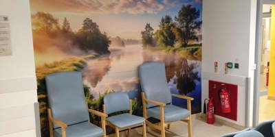
Colorful, engaging signage in children’s areas can create a welcoming atmosphere. One-piece wall vinyls are easy to clean and hard-wearing, ideal for medical environments.
Multilingual greetings and fun graphics add warmth and remove intimidation.
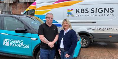
All the signage in our examples was created by Signs Express Southampton, showing how signage can be fun and informative while improving patient experience.
Practical Signage Applications
Totem signs and outdoor markers help people register key information—like pharmacy hours or parking rules—on their first visit so they can reference it later. Fascias are the final confirmation; totems are the navigators.
Feature Walls
Vinyl wallpapers brighten dull corridors and are more durable than painted surfaces. “Hello” in multiple languages on entry doors helps break down barriers and set a welcoming tone.
Signage can engage, reassure, and support visitors emotionally—not just direct them.
Final Steps
Start with a site survey. Walk your space and note what needs improvement. Then contact your local Signs Express centre to discuss your signage needs.
Use a professional sign company—they'll offer insights you may not have considered and deliver long-term value.
Closing Thoughts
This isn’t a box-ticking exercise. Think about your patients and how they experience your space. Make it easier for them to navigate, reduce stress, and ensure a positive first impression.
Visiting a healthcare facility can be daunting—especially if someone is already anxious about their appointment. Signage should remove as much of that burden as possible.
Thank you to Craig and Dave for sharing their insights today.
To find your nearest Signs Express centre, visit the link shown on-screen or get in touch using the contact details provided before the session. We're happy to support you further.
 Back to news


